For some time I have been keeping a close track of UK house prices. Thanks to our national obsession with housing they’re constantly in the news, but the average personal finance journalist merely regurgitates whatever propaganda the estate agents, mortgage lenders and house builders trot out. So here’s my attempt at showing a deeper look at the facts, which I will split into several parts. This part tries to put things into a bit of historical context.
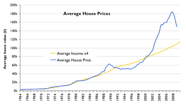
The chart below shows the history of UK house prices (according to The Nationwide) over the 45 years from 1964 to 2009 Q1 (i.e. this is based on figures released at the start of April 2009), and the average earnings index (according to the Office of National Statistics – more info here). Between 1964 and 2003 the average property has been almost exactly 4x the average income, so the chart actually shows incomes multiplied by 4 so that it’s easy to make this comparison.

What strikes you looking at this is how spectacular the latest house price bubble looks compared to years past. The late-80s bubble and 90s bust is also clear, but it’s hard to see anything of what went on before the 80s because inflation from the 70s and 80s means that everything is squeezed up. When it comes to things like house prices a 50% increase is just as significant whether it’s from £4,000 to £6,000 or from £100,000 to £150,000, but it doesn’t look that way on the chart.
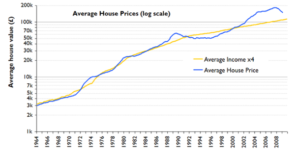
The obvious (and extremely rarely-seen) solution is to show the same data on a log scale, in which a % change is represented by the same vertical distance whether the actual value is large or small, shown below:

This shows that incomes and prices are closely linked, and this would make sense: the chronic shortage of houses in this country means that everyone will pay as much as they can afford (or believes they can), thus defining the market price. Some have said that low interest rates mean people can afford bigger mortgages, but I would argue this is only true if it’s low real interest rates. That’s something for a later article…
It’s also clear that prices have deviated from incomes plenty of times before, including a bubble in early 70s (burst by dint of high inflation rather than actual falls in house prices), another one in the late 70s (ditto), then the notorious bubble and crash of the 80s/90s which left many households in negative equity due to the unprecedented fall in nominal prices. This was then following by a sustained period of low inflation from the early 90s onwards, and the emergence of the bubble that is now deflating.
What I think most striking from the above is how sustained the noughties bubble was – it got going in 1999, kept surging ahead until 2004, and then stayed inflated (continuing to increase in line with or ahead of incomes) for at least another 3 years, defying gravity like a carton character that’s run off a ledge. It now seems that this was only made possible by a huge expansion in the amount of credit in our economy, imported from high-saving emerging economies and made possible by such toxic inventions as CDOs and the like.
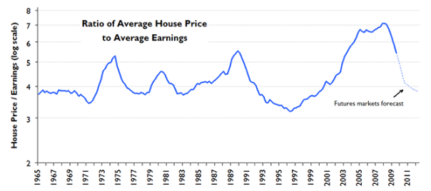
Given that prices and incomes look linked, let’s look at the ratio of the two…

This shows clearly the history of this relationship – an apparently relentless cycle of booms and busts. It also shows that despite recent falls the ratio has just reached thesame level it reached at the very peak of the 70s and 80s bubbles! If this housing cycle follows the pattern of those before it then the market will stabilise when this ratio drops below 4 (which was the average between 1965 and 2003), which on current form will be some time in 2010, with prices about 20% lower than they are now, and approximately 40% below their 2007 peak. In other words, that would mean we’re only half-way through this crash! And that’s exactly what the derivatives markets think: just published by Tradition, the latest figures on housing futures show that prices are expected to drop by 19% between now and March 2010. Whether that really will happen remains to be seen, but as a potential first-time buyer I am hoping so!
Part 2 will look into regional differences, and will shed some very illuminating light on just how big the differences are between different parts of the country and what it might mean for the future.
Excellent analysis, so pleased you didn’t fall into the trap of stating this one was super high and went to a log chart to restate your numbers.
LikeLike
Just want to say thanks for some solid sensible figure, came to your site via HPC and have just read the usual housing market cheer leading from the shrills at The Times. The log scales really hep to put things into long term perspective.
LikeLike
Thank you, very helpful
LikeLike
Excellent, cool headed analysis. Have a virtual cookie!
LikeLike
Nice plots, thank you!
It would be interesting to see house price to gold and house price to GDP ratios (eg data available at measuringworth.com but I’m not sure it goes all the way to present).
Does it really make sense to look at house price to earnings ratio on log scale? I don’t see why there should be an exponential trend in house prices to earnings because that would indicate people’s wealth is increasing exponentially out of line with their earnings(?)
I agree it does make sense to look at (say) real house prices on a log scale because wealth (eg GDP) increases faster than inflation.
LikeLike
Hi Peter,
I suspect HP to GDP would show a very similar picture but on a slightly downward trend because of population growth. Although actually it wouldn’t really be a meaningful ratio because you’re comparing an average of single units with an aggregate measure – you’d include the effect of population growth but miss out on the increase in the number of properties. More relevant would be GDP vs Total housing stock value, or GDP per household vs average House Price.
The reason for showing the income ratio on a log scale is to make it visually representative for % changes. For the ratio to shift from 3 to 4 is an increase of 33%, and if the ratio shifted from 6 to 8 that would also be a 33% increase, so if % differences are what you’re interested in then a log scale equalises the apparent size of those shifts. It would look pretty similar on a linear scale, and a linear scale is more appropriate if you are focused on multiples of incomes than on % changes, which would be quite valid. I’ll remember this for a future post!
LikeLike
I find it incredible that literally no-one in the media is talking this sort of sense; we seem to be in the middle of a bizarre form of mass hysteria – still!
If only more people took the time to interrogate the facts in this way.
One point I’d like to question though, is the idea of a housing shortage in the UK. I’ve heard a lot of persuasive arguments (on HPC, as one example), that the ‘shortage’ is actually a myth (as pervasive as the idea that house price increases were sustainable)? –
“the problem in Britain is a shortage of affordable homes rather than an overall property shortage”
The counter-argument is to do with a lack of a rent ‘bubble’, and comparisons with other countries, I believe. I’d love to know which in fact is the case…
LikeLike
Thanks for your comment Susannah.
Housing shortage – good challenge. I agree with you – my main point was that the relative lack of housebuilding means that the link between incomes and house prices will be most fundamental. I think it’s accepted that the construction of new properties in this country is way behind the increase in the number of people/households, because the planning system (with its green belts and such) makes it so hard to knock up a new building. The USA doesn’t have that problem which is why its housing crash has resulted in millions of unoccupied properties. That’s not true here – the prices aren’t being driven down because of a glut of properties as in the US, they’re being driven down by a lack of demand at previous prices because credit has been restricted. In other words, the market in the UK is driven almost entirely by changes in the demand curve, whereas in the USA it is also driven by movements in the supply curve. Japan has even less habitable land than here and yet they’ve managed to clock up 17 years of continuous house price falls, which illustrates how the demand curve is generally what drives the prices.
LikeLike
Ah, found it – this is from an ABN AMRO report:
“Housing in both the US and UK looks expensive relative to
historic relationships. But the degree of overvaluation in the UK appears much more severe. Relative to rents, UK house prices look inflated by nearly 50%. The equivalent measure for the US suggests a 25% overvaluation.
Deflating conventional wisdom In recent years, numerous attempts have been made to rationalize the growing
premium on UK housing. These arguments generally point to supply shortages (due to the UK’s perceived lack of undeveloped land), a fundamental increase in demand
(due to immigration or demographics) or most often, some combination of the two.
While these arguments might seem theoretically appealing, the evidence does not seem to support them. The most obvious counter-argument is that rents have remained subdued relative to house prices. As already noted, any increase in housing demand relative to supply should put upward pressure on rents, as marginal buyers get forced out of the market and are forced to rent.
The strength in house prices has
also encouraged a significant supply response in recent years […]
We can also cross-check this conclusion by looking at house price trends in other countries. As [Attached chart] illustrates, the Netherlands, Belgium and Japan have a tighter supply of land, while Germany and Italy have similar population densities to the UK. Yet these countries have all seen less rapid increases in house prices than the UK has in recent years”
LikeLike
Great Blog keep it up!!! As someone who is clearly knowledgeable about these things, I wondered if you might be able to clear something up for me?
As I understand it, (and I could be wrong) – the consequences of ‘negative equity’ appear to be somewhat different in the US versus the UK. In the US, if your house value starts to go into the red you can simply stop paying the bank and give back the keys (whilst presumably forfeiting a deposit of some kind?).
With the loss essentially being borne by the banks who leant you the money. This is very different from the UK where if such a situation happens the emphasis is on the home-owner bearing the brunt of the loss.
If this difference is true, it has a very interesting consequence on what happens in the same scenario (a falling housing market). In the US as the ‘bubble’ deflates it effectively accelerates over time (as more and more home owners give up and hand over their keys). In the UK the process is likely to be much much slower, since most owners will simply grin and bear it – and not sell. The majority of sales will be ‘within-markets’ (owners with equity in their houses trading up or down with each other) and the rest will be ‘distressed’ sales
(sellers who for what ever reason – unemployment – HAVE to sell). As a result, if this logic is correct we can expect that the market will be a very different beast from that of the US.
My guess is a long contracted stagnant market, with mild contraction as sellers waiting for wage inflation to effectively enable new buyers to purchase their houses at levels that won’t result in a significant equity hit….. pretty much Japan.
Thoughts?
LikeLike
Thanks Jez,
Yes, I gather that in the USA the mortgage goes with the house, so owners can (and do) walk away if it goes in the red, whereas in the UK the mortgage goes with the owner, so that’s not an option. Your conclusion (that falls will be much faster in the USA) sounds completely sound, and yet the falls in the UK have also been astonishingly rapid – 4-5% every quarter, very close to the rate of falls in the US.
I think the reason that there isn’t such a big difference is (again) about demand and supply curves, which are what ultimately define the price of any market. The fact that owners can walk away in the USA means that ‘underwater’ owners flood the market with extra properties that they walk away from, increasing supply and so pushing prices down. That’s definitely a factor at work. However, I believe the bigger driver is still the movement in the demand curve. Bubbles are ultimately caused by herd psychology – lots of people who want to buy just because they expect the market to keep going up, thus pushing the market up further. The moment that psychology reverses (when people realise it’s not true, and the converse case of people avoiding buying because they expect prices to fall) the demand curve shifts profoundly, pulling prices down like a stone.
I think this psychological dynamic is why the housing market is not going to suddenly change direction back into growth – these things swing slowly, as the smooth movements of the incomes ratio graph demonstrates. And while prices continue to be falling rapidly in the UK potential first-time-buyers will continue to avoid entering the market, thus keeping the market falling.
LikeLike
I think you are perfectly right. The graphs are great and do support your comments and conclusions. Nice piece of work.
Cheers.
Answer to Jez – I think you are also right in your analogy and things may well happen the way you described.
LikeLike
I was talking to an ex-banker back in July 2007. He said that house prices would fall by as much as 60% from their peak. At that point we both agreed that we were not far from the peak. As it happens, house prices peaked in August 2007.
Whilst 60% may sound like an extreme figure, I can see that happening in some cases such as city centre flats. In fact, some properties may prove to be impossible to sell at all!
LikeLike
Probably the best analysis of house prices I have read.
Due mainly to the fact it is not tainted by the desperate views of estate agents, mortgage lenders and brokers.
Well done!
LikeLike
Interesting site. hope to definitely visit again:)
LikeLike
I think the negative comments have been deleted, because there’s a lot wrong with this analysis. Principally, drawing this out on a log scale with arbitrary multipliers for scaling is misleading, both cosmetically and theoretically, if the audience sees significance in the ‘straightness’ without appreciation of the deceptively small size of the fluctuations. Would it surprise you to know that this is the same graph format the banks used to fool themselves and the investors? Secondly, it’s the NOISE on the graph that bankrupts people, not the overall shape, and the steeper the relative slope, the more unpredicatable, and the greater the size of the noise. The fundamental mistake involves the requirement to measure growth as a percentage, leading to exponential rise. As any decent scientist will confirm, any exponential system will fail catatrophically, and probably sooner than expected, as soon as it’s even slightly disturbed.
Your article, far from being clever, is merely a repeat of the error of comprehension used to hoodwink the public in recent times.
LikeLike
Hi Bob. Thanks for your comment, though I have to confess that I’m not entirely clear what you’re arguing.
Log scales are not without their problems, as they do not have an intuitively natural relationship with the actual size of things – all I’m really saying is that they can be a good way of seeing a continuous pattern when the magnitude of the thing being observed varies a lot (e.g. average house price of £4,000 in 1964 vs. £180k in 2007). The crash of the early 90s was just as bad as the one we’re in the middle of, but a non-log-scale graph doesn’t convey that. I don’t think measuring growth as a percentage is a mistake in this situation – a £1,000 fall in the value of a 1964 house would have just as big an impact on its owner as a £45k fall in the value of a 2007 house, so focusing on seeing both as 25% falls makes a lot of sense.
Incidentally, any expert on complex systems (such as the housing market) will tell you that all sorts of wild exponential gyrations can happen in the short term when you have positive feedback loops (e.g. prices going up -> people want to buy to benefit from price rises -> higher demand -> prices go up -> etc.) but the longer term behaviours are grounded in negative feedback loops (e.g. prices going up -> less people can afford to buy -> lower demand -> prices go down again). The housing market hasn’t failed, that negative feedback loop has just reasserted itself.
For the record I have not deleted any comments.
LikeLike